How the best startups are cashing in on branding
Some of the best startups in recent years are also among the few, rare new brands gaining phenomenal traction on global markets in just years or months – by nailing their branding right there on the pitch deck when looking for startup funding.
The best startups craft brands worth $100 million bucks
In 2014, a small, year-old startup brand from New York City took FMCG giants Gillette and Schick head on in some of their largest markets. Harry’s is an e-commerce and manufacturing company behind a new line of shaving equipment sold by mail order and now retail, engineered and manufactured in a 100-year-old German plant that the Harry’s purchased after a well-planned funding round of over $120mn in 2014.
What really put Harry’s over the top are the startup’s brand story and social media presence. With a nimble in-house design and product development team, Harry’s has kept its overall design simple, modern, minimalist and as clean as the shave they promise.
The brand’s guidelines call for an “approachable, bold and honest” look and feel, so the company avoided any over-complicated branding and colour schemes when they laid down their design law.
Instead, Harry’s opted for a dark blue lettered logotype, using a timeless sans font, Brandon Grotesque, and boiling the logo down to an apostrophied capital “H” when push comes to shove. Simple, clean and masculine is what the brand seems to promise – also known as a damn good shave.
Harry’s then took it all to social networks, where they called on their target audience to do things like #ownyourAM, tapping into product-related movements such as Movember to mobilize the brand story (and sales) with a National Shave Day on December 1st.
Needless to say, there’s no 5 PM shadow on this startup. Sales seem to be soaring and Harry’s is already diversifying its line of products and trying new things, branding and voice intact.
What’s in a startup brand name?
At Thinkruptor, we’re really big on the whole name thing. Being the motley crew of experienced business owners and startup investors that we are, we knew a remarkable but clear name was what would help tell our story.
So, instead of “Future Mindset Changing for the Purpose of Modern Business Success Company,” we decided to come up with a brand new word. And, knowing how popular quirky new words and deliberate misspellings were among 21st century startups, we thought long and hard about it. Standing out with a quirky, new word isn’t what it used to be.
In the end, we think Thinkruptor is pretty self-explanatory. But, in case Merriam Webster is watching, that’s – n. \ˈthiŋk-ˈrəp-tər\: to think or conceive in a manner that will disrupt the status quo – and can also be used as a transitive verb, “to thinkrupt,” or an adjective, “thinkruptive.”
Like Facebook, Instagram or BuzzFeed, we didn’t just want an unusual, new compound word by dropping a vowel or deliberately misspelling a commonly used term. We wanted the first chapter of our story told, and clearly, in just one or two words. Or two words in one.
Some now well-known brands that got it right on the first try were Etsy, Digg, TechCrunch and Upwork (rebranded from Elance, which wasn’t bad either).
Though included on some of the list of best startups in terms of success, company names we’re not so in love with are Bukalapak, Stupefix, Kaggle and Parse.ly. Not that there’s anything explicitly wrong with these names. We – and probably their target audiences – are just unclear on what it is that these companies do, offer or what’s behind the brand.
Google’s recent restructuring and rebranding move takes the cake when it comes to lack of clarity and managing to utterly confuse an existing, multi-billion, global target audience. The beloved internet giant took a household name and turned it into – Alphabet.
So Google is moving from the data business into the… letter business? They’re going back to basics? Focusing on products for first-graders?
We’re confused and we have a question for every letter of the Alphabet. Which goes to show that, if you’re a company as big as Google, you get to pick a random name and still keep growing. But don’t try this if you’re a startup.
La vie en rose or paint it black?
Brand colors speak volumes. Humans are very visually-oriented creatures. We don’t often listen or feel for a person in a room, we look for them. The web, today’s premier spot for business promotion and sales leads in most industries, is all about looks.
Although honing the message and story behind the company brand should always be of primary concern, there’s a whole psychology behind the way people perceive and understand colors, which can do wonders for a brand story.
Google (not Alphabet) is a great example of using colors in a brand, though Coca-Cola, the company that very well may have invented the concept of modern branding, remains a master at demonstrating what color can do for an unknown new company.
Red has always been a popular color for company and storefront lettering, and this was no different in the early 20th century, when Coca-Cola began its rise to fame. Not the contemporary, growth-hacking companies of the time, business of the time seemed to move a little slower in terms of growth and development. It took the company decades, several owners, and some complex startup funding issues of its own to grow from being just a product to one of the best startup brands of its time.
By the 1920s, Coca-Cola had become a well-known brand and a favorite beverage, at least when warm weather called for a refreshment. Sales, however, plummeted in colder weather and the company struggled in winter months, dealing with high overhead costs they needed to maintain for high season production capacity.
By 1031, Coca-Cola began placing ads in popular magazines, in particular during their slow season, and hired the D’Arcy Advertising Agency.
D’Arcy executive Archie Lee decided to tie into the brand’s target audience – the wholesome, middle-class, American family – by tapping into their favorite holiday, Christmas. He hired illustrator Haddon Sundblom to develop a slew of advertising collateral using a repurposed Santa Claus.
Sundblom took the traditional image of Santa Claus, a usually large and somber man donned in green and brown, then turned his frown upside down, added some color to his cheeks, some stuffing to his belly, dressed him in Coca-Cola colors and put an anatomically correct bottle of Coke in his jolly hands.
This is the Santa that everyone around the globe now believes represents the true spirit of the season. Yes, Coca-Cola owns the red-and-white with silver linings Christmas we all know and love.
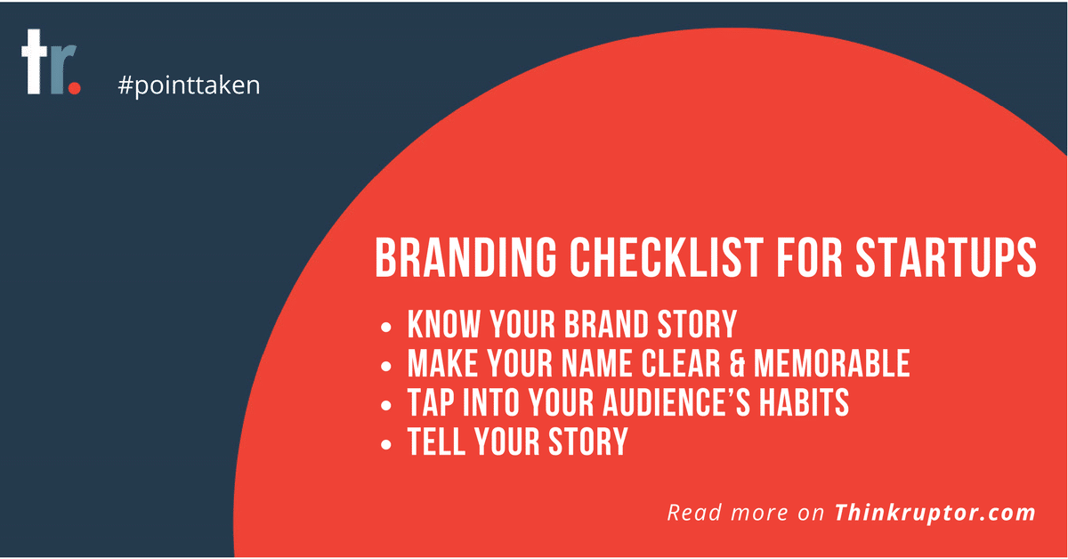
Branding checklist for startups
- Know your brand story
- Make your name clear and memorable
- Tap into your audience’s habits
- Tell your story